At a glance
Each dimension opens into an "In detail" list: click any row for the evidence and the options behind it. You can also open the site we reviewed to follow along.
Recommended priorities
Ordered by impact. Each line is a gap we found, paired with the capability or fix that closes it. Mark one here and it stays in step with the same finding in the detail below.
- HighNo way to book a class online, any timeOnline booking
- HighInterested visitors who aren't ready to call leave no traceEmail capture
- HighThe studio is invisible in local searchStructured data
- HighLow-contrast buttons make the calls to action hard to readAccessibility pass
- MediumAn off-the-shelf template stands in for a real brandDesign & build
- MediumNo real photography or proof (reviews, coaches)Content & messaging
- MediumStandard security headers are missingSecurity review
- LowNo canonical URL or social-share tagsSocial-share preview
Detail by dimension
1. First impressions & positioning
The opening gets the basics across: within a screen a visitor knows this is a fitness and yoga studio in Bristol, and there is a button to act on. But it does nothing to say why this studio rather than any other. We read the page as two buyers: a local newcomer who wants a welcoming, non-intimidating place to start, and an experienced mover who wants variety and good coaching. Both learn what Blackbird is, and almost nothing about what makes it worth choosing.
- 1.1The basics are presentThe studio, that it does fitness and yoga, and the city are all stated in the first screen, so nobody has to hunt for what this is or where it is.
✓No broken or high-risk issues found in this area.
- 1.2The opening is generic and undifferentiated"Welcome to Blackbird Studio" and "a friendly studio for all abilities" could describe any gym in the country. Nothing says why this one.
- 1.3The main call to action is low-intentThe hero button is "Get in touch" rather than "Book a class" or "Try a free class", so the strongest moment on the page asks for the smallest possible step.
- 1.4No proof anywhere near the topThere is no review, rating, member voice or face, so a cautious newcomer has only the studio's own word that this is a good place to start.
1.1WorkingThe basics are present
The studio, its two disciplines and the city are all in the first screen, so a visitor never has to work out what this is or where it is.
1.2To improveThe opening is generic and undifferentiated

The hero is a flat colour band with a generic welcome line. It reads as a template that has had the studio's name typed into it, not as a place with a point of view. A newcomer weighing two or three local studios has nothing here to prefer Blackbird by.
- Lead with a distinctive line and a real image of the studio in motion
- Name the experience, not the category ("small classes, coaches who know your name")
- Put the free first class in the hero as the reason to act now
1.3To improveThe main call to action is low-intent
"Get in touch" asks for the smallest step at the moment the visitor is most interested. A ready-to-act newcomer has to translate that into finding the phone number and calling in office hours.
- Make the primary action "Book a free first class"
- Repeat it wherever a visitor makes a decision (hero, timetable, prices)
1.4To improveNo proof anywhere near the top
Every claim is the studio's own. One short, named member voice high on the page answers "have real people like me started here and stayed" in the moment the decision is made.
- Place one short, named member quote high on the page
- Add a small trust cue: a rating, a member count, or years open
2. Design & brand
The site is clean and readable, which is worth stating: nothing is broken and the layout holds together. But it is an off-the-shelf template with the default theme still on it. The teal-and-orange palette, the system font, the drop-shadowed boxes and the gradient pill buttons are the giveaways of a builder template, and there is no photography at all, only grey placeholder blocks where the studio should be. For a boutique studio whose whole appeal is atmosphere, the look undersells the room.
- 2.1Clean, readable and unclutteredThe layout is simple and easy to follow, with a clear structure and enough breathing room. It is a sound base to build a real brand onto.
✓No broken or high-risk issues found in this area.
- 2.2An off-the-shelf template lookThe default theme, system font and gradient buttons make the site indistinguishable from countless other template sites, with no brand of its own.
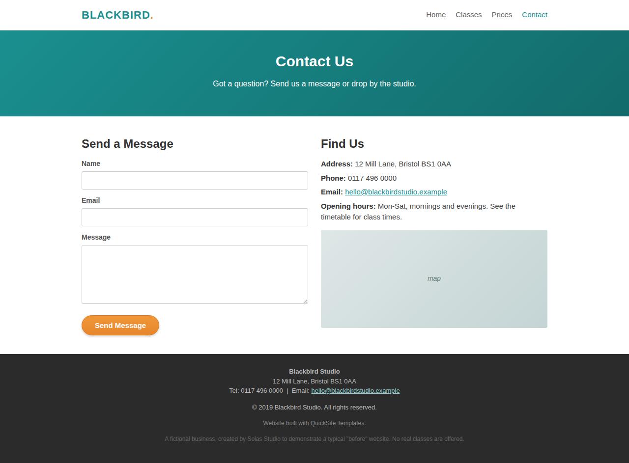
- 2.3No real photographyThe studio, the classes and the people are shown as grey "studio photo" and "map" placeholder blocks. The single most persuasive asset a studio has is missing.
- 2.4Dated visual detailsGradient pill buttons, heavy drop shadows and a 2019 copyright line read as a site that hasn't been touched in years.
2.1WorkingClean, readable and uncluttered
The structure is simple and the page is easy to scan. That is a genuine base to build on, the problem is not clutter, it is the absence of a brand.
2.2To improveAn off-the-shelf template look
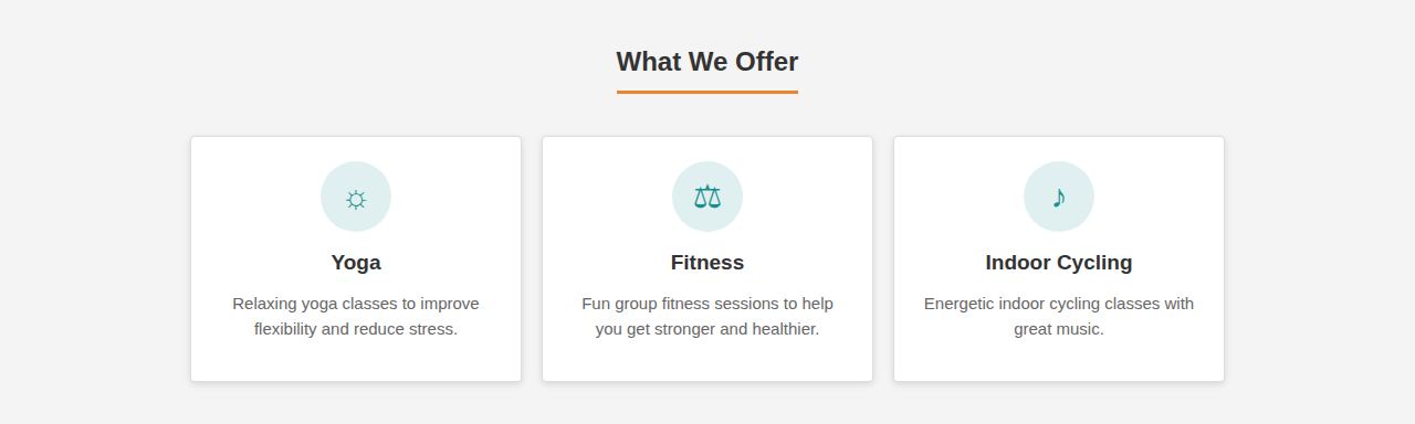
The default teal-and-orange theme, the Arial system font and the boxy cards are the fingerprints of a site builder with the theme left as it shipped. It works, but it says "template", which for a premium studio quietly undercuts the price on the next page.
- Design a small brand of your own: one palette, a real typeface, a consistent set of tokens
- Replace the gradient buttons and boxy cards with a simpler, more current treatment
2.3To improveNo real photography
Grey placeholder blocks stand in for the studio and a map. A boutique studio sells a feeling, and the site currently shows none of it. Real images of the room, a class mid-flow and the coaches would do more than any amount of copy.
- Commission or supply a small set of real studio and class photos
- Use them in the hero, the class cards and beside the membership plans
2.4To improveDated visual details
Gradient pill buttons, heavy shadows and a "© 2019" line in the footer all signal a site that has been left to age. None is broken, but together they date the studio.
- Refresh buttons, cards and spacing to a current, simpler style
- Keep the footer year and content current automatically
3. Content & messaging
The practical facts are all here: classes, a timetable with named instructors, and clear prices. That is more than many studio sites manage. But the writing tells rather than shows, and leans on generic phrases ("we love what we do", "something for you", "friendly instructors") that ask the reader to take it on faith. There is no proof, no specificity and no personality to make any of it land.
- 3.1The practical facts are clearClasses, a weekly timetable with named instructors, and prices are all stated plainly, so a decided visitor can find what they need.
✓No broken or high-risk issues found in this area.
- 3.2The copy tells instead of showingGeneric lines like "we love what we do" and "something for you" ask to be believed rather than earning it with a specific.
- 3.3No proof or peopleThere are no testimonials, no member stories and no coach bios anywhere. The instructors are named in the timetable and nowhere introduced.
3.1WorkingThe practical facts are clear
A decided visitor can find the timetable, the instructors and the prices without friction. The information is there, it just isn't doing any persuading.
3.2To improveThe copy tells instead of showing
"We have been running classes for a few years now and we love what we do" is warm but empty. A single concrete detail, how big the classes are, what a first session is actually like, what a coach will do for a nervous beginner, would do more than a paragraph of adjectives.
- Replace generic lines with one concrete promise per section
- Say what actually happens in a first class, in plain words
3.3To improveNo proof or people
The instructors appear as first names in a timetable and are never introduced. A line and a face for each turns "friendly instructors" from a claim into real people a newcomer can look forward to meeting.
- Add two or three short, named member testimonials
- Introduce each coach with a sentence and a photo
4. Technical & SEO
The plumbing is simple and mostly sound: pages load quickly, they are mobile-responsive, and each has a title. But the site is close to invisible to search. There is no structured data telling Google this is a Bristol studio with opening hours and prices, the metadata is thin and generic, and there are no social-share tags, so a link shared to Instagram or WhatsApp shows a bare preview. For a local business that lives or dies on being found for "yoga classes Bristol", this is the most costly gap on the technical side.
- 4.1Fast and lightweightThe pages are small and carry no heavy scripts, so they load quickly, which both visitors and search engines reward.
- 4.2Mobile-responsive, with titles setThe layout adapts to a phone and each page declares a title and viewport, the baseline search results and browser tabs rely on.
- 4.3No structured data, so invisible to local searchNothing tells search engines this is a Bristol fitness studio with opening hours, a location and prices, so it misses the map and local results that send a studio its walk-in traffic.
- 4.4Thin, generic metadataTitles like "Blackbird Studio - Home" and a vague description carry no intent for what people actually search.
- 4.5No canonical or social-share tagsNo canonical URL, and no Open Graph tags, so shared links preview poorly.
- 4.6No analytics or measurement in placeNothing is measuring visits or where people drop off, so every decision about the site is a guess.
4.1WorkingFast and lightweight
Small pages, no heavy scripts, quick to load. A genuine strength, and one worth preserving in any rebuild.
4.2WorkingMobile-responsive, with titles set
The pages adapt to phone screens and each sets a title and viewport, the baseline that browser tabs and search results depend on.
4.3HighNo structured data, so invisible to local searchSEO Plus
Structured data is a short, machine-readable summary in the page that tells search engines exactly what your business is: a fitness studio, in Bristol, with these opening hours and prices. Without it, Google has to guess, and a studio that could be showing up in the local map pack and "near me" results instead sits invisible, while competitors who added it get the walk-in traffic.
No LocalBusiness / ExerciseGym structured data present. No opening hours, address or price schema. This is the single biggest reason a local studio fails to appear for "yoga classes Bristol" and map searches.
- Add LocalBusiness structured data with address, hours, geo and price range
- Pair it with a Google Business Profile so the two reinforce each other
- Give each class type its own clearly named, findable content
4.4To improveThin, generic metadata
<title>Blackbird Studio - Home</title>
<meta name="description" content="Blackbird Studio - fitness and yoga classes.">
The title and description read like placeholders. They carry none of the words a person actually types ("yoga Bristol", "beginners fitness class near me"), so even when the page is found it doesn't earn the click.
- Write a specific title and description per page, aimed at real searches
- Include the city and the disciplines people search for
4.5LowNo canonical or social-share tagsSEO Plus
A canonical tag tells search engines which version of a page is the real one, so ranking isn't split across near-duplicates. Open Graph tags control how a link looks when it is shared: with them, a link to your site posted on Instagram, Facebook or WhatsApp shows a title, description and image; without them, it shows a bare, unappealing line that few people click.
No <link rel="canonical"> present. No Open Graph (og:title, og:image, og:description) tags present, so shared links have no preview image or caption.
- Add a self-referencing canonical to each page
- Add Open Graph tags and one strong share image
4.6To improveNo analytics or measurement in place
Nothing is measuring visits, where people drop off, or which classes draw interest, so every decision about the site is a guess rather than something you can see and act on.
5. Accessibility
Some accessibility foundations are in place: the page language is set and headings run in a sensible order. But there are real contrast problems, and one of them sits on the most important element on the site. The primary buttons put white text on a light orange gradient, which fails the standard readability threshold, and the teal links and grey helper text are borderline too. These are not edge cases: they make the calls to action harder to read for a meaningful share of visitors, and they are quick to fix.
- 5.1Sound document basicsThe page language is declared and headings run in order, so a screen reader can move through the page in a logical sequence.
- 5.2Primary buttons fail contrastWhite text on the orange gradient button falls below the AA readability standard, so the most important actions on the page are the hardest to read.
- 5.3Borderline links and helper textThe teal links and the light-grey notes sit at or below the contrast threshold, so they are harder to read than they should be.
5.1WorkingSound document basics
The lang attribute is set and headings are in order, which helps assistive technology present the page correctly.
5.2HighPrimary buttons fail contrastAccessibility pass
The buttons are the point of the page: "Get in touch", "View classes", "Send message". They put white text on a light orange gradient, and that combination falls below the minimum contrast the accessibility standard sets for readable text. In practice that means anyone in bright light, on an older screen, or with less-than-perfect vision has to work to read the very things you most want them to click, and it is a common trigger for accessibility complaints.
Button label: #FFFFFF on gradient ~#E8862C. Contrast ratio ≈ 2.4:1. WCAG AA requires 4.5:1 for normal text and 3:1 for large text. Fails on both counts.
- Darken the button colour or use a darker label until it passes AA
- Re-test every button state with a contrast checker
5.3To improveBorderline links and helper text
The teal links (#1a8f8f) and the light-grey helper notes hover around the contrast threshold. They are readable for most people, but not comfortably so, and small fixes bring them safely over the line.
- Darken link and helper-text colours to clear AA
- Do it as part of a small, defined accessibility pass across the site
6. Security & infrastructure
There is little to worry about here, largely because the site is simple: static pages with a small attack surface. The one improvement is to add a set of standard security response headers, which harden the site against a class of common browser-level attacks and are quick to put in place.
- 6.1A small, simple attack surfaceStatic pages with no logins, no database and no server-side processing mean there is very little here for an attacker to target.
✓No broken or high-risk issues found in this area.
- 6.2Missing standard security headersStandard response headers that harden the site against common attacks are not set.
6.1WorkingA small, simple attack surface
There are no logins, no stored customer data and no server-side code, so the things that usually put a small business at risk are simply not present.
6.2MediumMissing standard security headersSecurity review
Security headers are small instructions your site sends a visitor's browser telling it how to behave safely. When they are missing the browser has fewer safeguards, which leaves the door open to common attacks. For a real business that shows up as a customer's trust or, at worst, their data being put at risk, and as a lower security rating that some services now check.
Standard security response headers (Content-Security-Policy, X-Content-Type-Options, Referrer-Policy) are not set. These harden the site against a class of common attacks and are quick to add at the edge.
- Set the missing headers at the edge or in the host config
- Start with Content-Security-Policy, X-Content-Type-Options and Referrer-Policy
7. Conversion / UX
This is where the current site costs the studio the most. There is no way to book a class online, no way to leave a card or a deposit, and no way for an interested visitor to leave their details. Every path funnels to the same instruction: call or email during office hours. The contact form doesn't help, it shows a thank-you in the browser but there is no sign it reaches anyone, and no automatic reply. A visitor who is ready on a Tuesday evening, on their phone, has nothing to do but remember to call tomorrow, and most won't.
- 7.1A clear, simple path to the essentialsThe nav gets a visitor to the timetable, the prices and the contact details without confusion. The information architecture is sound.
- 7.6Pricing is shown upfrontDrop-in, membership and class-pack prices are clear and upfront, which the visitors who want to know before they enquire will appreciate.
- 7.2No online booking at all"We don't take bookings online, please call or email." Every booking depends on the studio being reached by phone in office hours.
- 7.3No way to capture an interested visitorNo email capture, and a contact form that leads nowhere the studio can follow up from, so a "not today" visitor leaves no trace.
- 7.4No payment or deposit onlineJoining and booking happen offline, so the moment of highest intent isn't captured and free spots can no-show at no cost.
- 7.5No instant answersA visitor's practical questions (is it for beginners, what do I bring) go unanswered unless they phone.
7.1WorkingA clear, simple path to the essentials
The navigation takes a visitor to the timetable, prices and contact details cleanly. The structure is right, it is the actions on top of it that are missing.
7.2HighNo online booking at allOnline booking
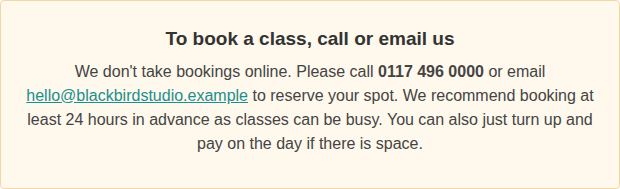
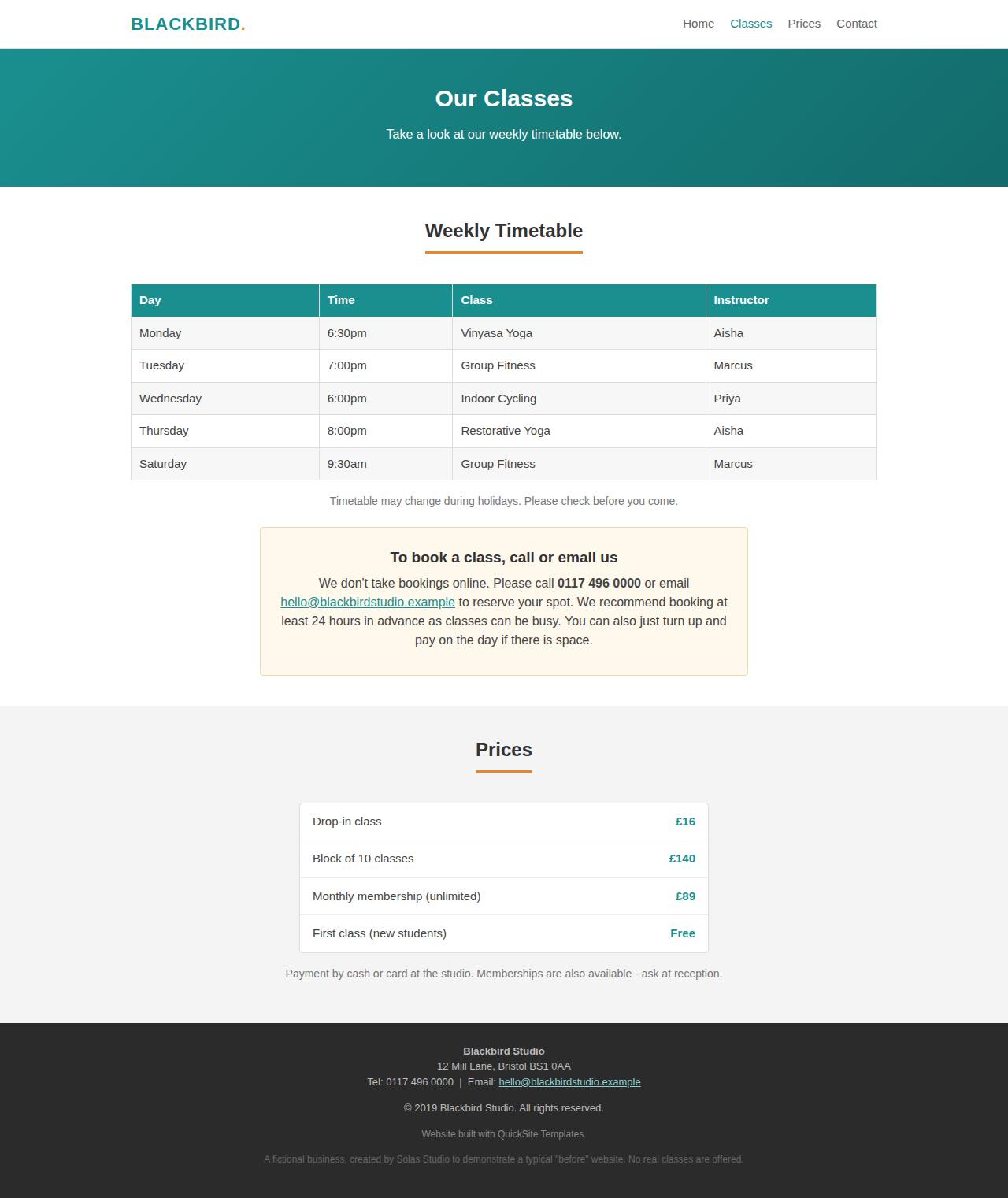
The classes page states plainly that bookings aren't taken online and asks visitors to call or email, at least 24 hours ahead. That puts the studio's phone line between every visitor and every class. The person most likely to book, someone browsing on their phone in the evening, is exactly the person who can't act.
- Add online class booking with an instant, branded confirmation
- Offer a free-first-class booking as the low-commitment way in
7.3HighNo way to capture an interested visitorConversion / UX
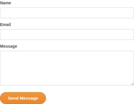
The only way to make contact is a form that resets and shows a thank-you in the browser, with nothing to confirm it was sent or received, no automatic reply, and no list. A visitor who is interested but not ready to commit has no low-stakes step, so they leave and the studio never knows they were there.
- Wire the form to a real inbox with an instant branded auto-reply
- Add a light email capture ("get the timetable and your free-class offer")
7.4To improveNo payment or deposit onlinePayments / checkout
Payment is cash or card at the studio only. Nothing takes a membership payment at the moment someone decides to join, and nothing holds a booked spot, so a free class can be booked and quietly missed at no cost to the person who booked it.
- Take membership payment online at the point of joining
- Add an optional small, refundable deposit on booked classes
7.5To improveNo instant answersAI assistant
A newcomer's real hesitation is the practical unknown: do I need to be fit, what do I bring, can I freeze a membership. Right now the only way to ask is to phone, which is exactly the friction a nervous first-timer won't push through.
- Add an on-site assistant trained on the studio's real answers
- Also put the "your first class" essentials in plain sight on the page
7.6WorkingPricing is shown upfront
Drop-in, membership and class-pack prices are clear and upfront, which the visitors who want to know before they enquire will appreciate. A genuine strength.
A wider lens
Business opportunities we noticed
While reviewing your site, a few wider business opportunities stood out: places where the studio could be winning or keeping more custom, beyond fixing the site itself. These are lighter observations than the website review above, a starting point for a conversation. We've written them up properly in the business audit alongside this one.
- Have you mapped the member journey end to end?From a first search, to a free class, to the third visit, to renewal, to winning back someone who lapsed, each step is a place to keep or lose a member. Walking the whole journey usually surfaces one or two easy wins.
- Where might revenue be quietly leaking?No deposit on classes, no prompt to book the next one, and no way to reach a member who drifts away are the usual gaps. Small changes here tend to pay for themselves quickly.
- Who is your most valuable, underserved member?There is usually one group, say the committed regular versus the occasional drop-in, worth the most and served the least by the current site. Speaking to them directly can lift the average membership value.
These sit alongside the website work, not instead of it. The full write-up is in the business audit; for now, the priorities above are the place to start.
How we reviewed your site
We assessed 3 of your core pages (home, classes and contact) across the seven dimensions above, combining industry-standard tooling (Google Lighthouse and axe for performance, SEO and accessibility) with hands-on review of your positioning, design, content and conversion. The review was read-only and non-intrusive: we didn't submit any forms or bookings, and did nothing that would affect your site or its data. You can see the site we reviewed here.
What this review could and couldn't see. This is a passive snapshot: we reviewed your site the way a normal visitor sees it, from the page's own markup and a still screenshot. It does not exercise interactive elements or capture animation; it doesn't see logged-in or otherwise dynamic states; and it submits nothing. A few observations are read from the page structure and are worth a quick check on the live site.
The pages we reviewed
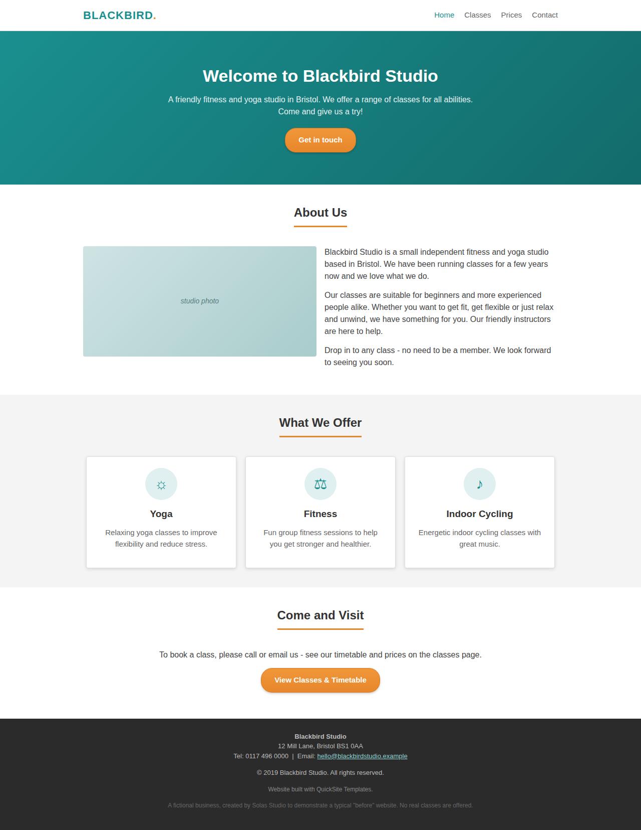
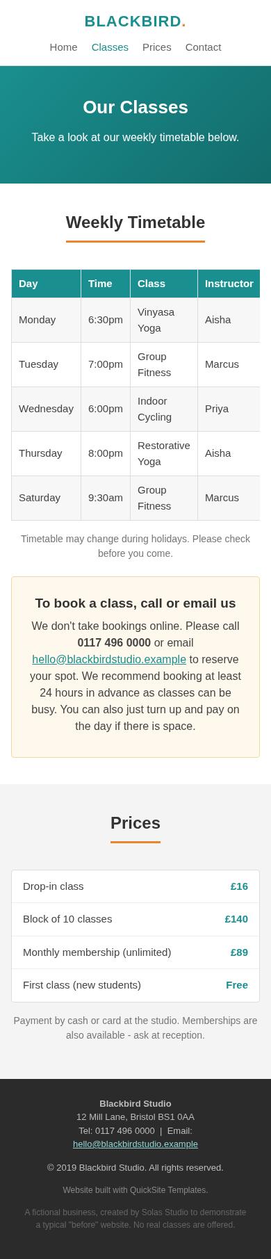
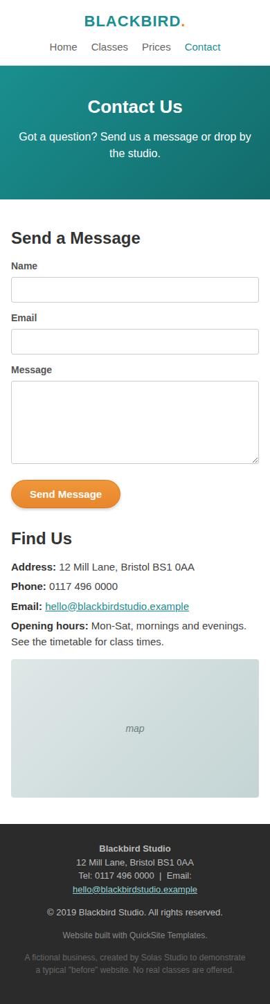
Full-length screenshots of each page we reviewed, captured 2026-07-19. Scroll within a frame to see the whole page.

When you are ready
Book your walkthrough
Marking up where you stand as you read is optional, but it is how you get the most from the call: it gives us your priorities to work through together. Either way, book a call and we'll go through it. It's included in your audit, with no cost and no commitment.